Rebooting Product Adoption Through Scenario-Based Content Design
McAfee (now Trellix) had launched a new generation of its flagship endpoint security product, but customer adoption was stalling. While previous versions had been installed on more than 57 million systems, the new version had fewer than 50,000 installations. To reverse the trend, the company launched an initiative to achieve a 99.95% installation success rate.
I redesigned the installation content experience, transforming fragmented, incomplete guidance into a scalable, scenario-based content model that improved usability, increased engagement, and supported product adoption.
Although the challenge was initially framed as a findability issue, my analysis revealed the root cause was the content design itself: the information did not reflect how customers actually installed the product.
Customer journey investigation
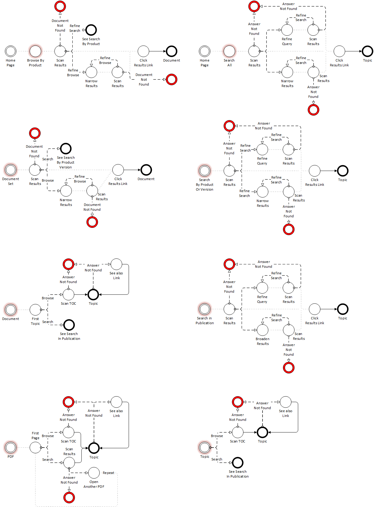
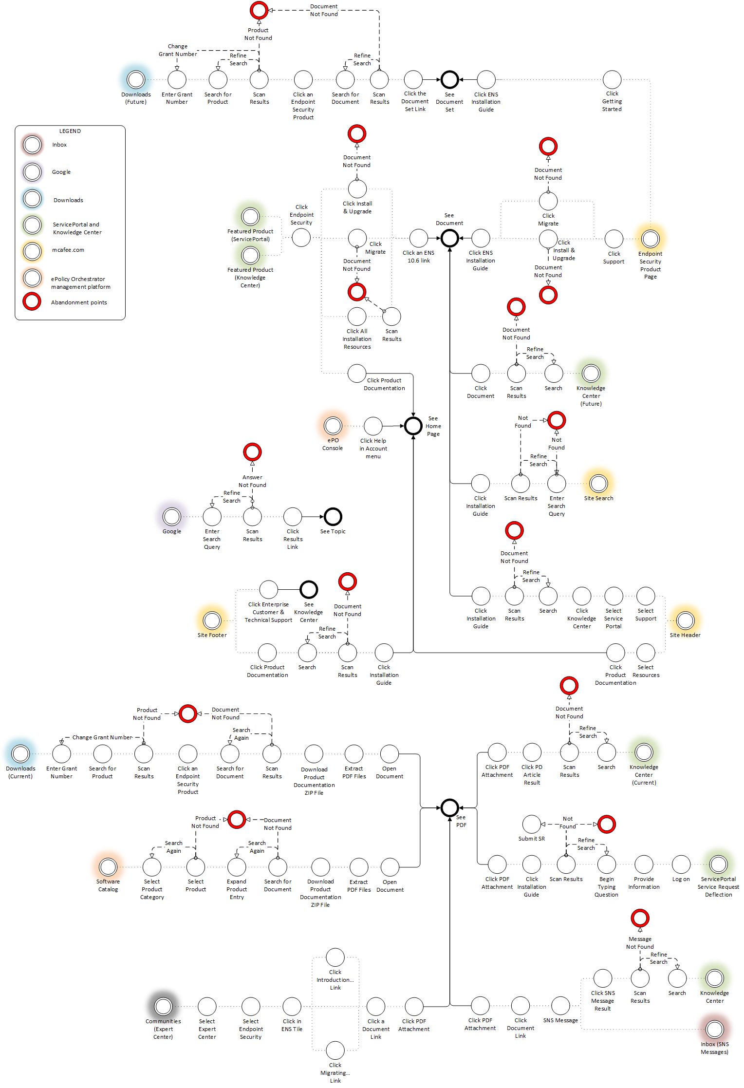
To understand why customers were struggling to find and use installation content that we thought was highly visible and complete, I mapped all customer paths to our installation content—from Google searches to our support site to the documentation portal navigation.
This exercise revealed that findability wasn't the core problem; customers could find the content.
PATHS WITHIN DOCS PORTAL
PATHS OUTSIDE OF DOCS PORTAL
Content architecture analysis
Once I disproved the accepted diagnosis (findability), I analyzed how the content was constructed and found that the real issue was the content itself:
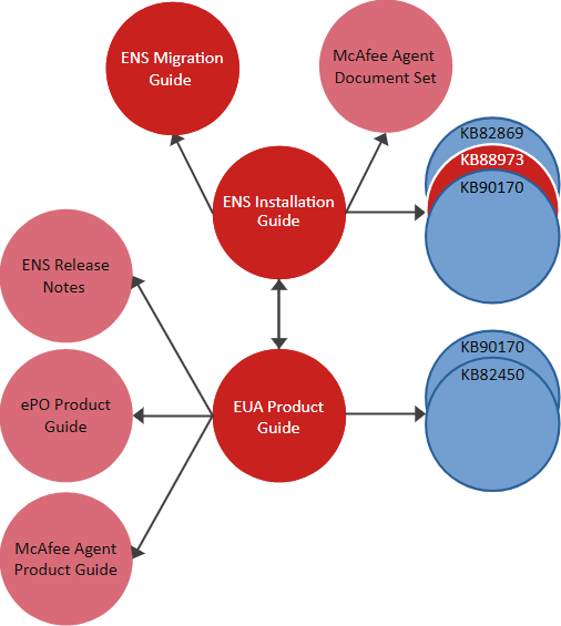
Installation instructions were fragmented across 3 different guides and 1 support knowledge base (KB) article AND hosted on 2 different portals.
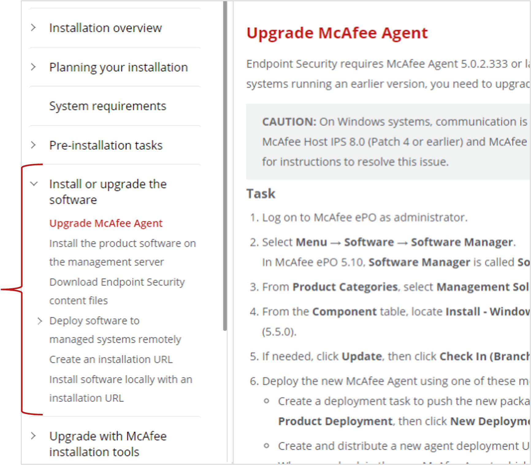
A handful of generic tasks were trying to cover 20 unique installation scenarios.
Details necessary for customers to successfully install the software in their specific environment were missing.
This made it nearly impossible to optimize for search and difficult for customers to find their specific scenario.
CONTENT SCATTERED ACROSS DELIVERABLES AND PORTALS
Where a generic approach fails…
Why a generic, “all-in-one” approach doesn’t work:
Gives users all the pieces, but the directions to specific scenarios were left out.
Because content is in different locations, users must make multiple trips to find all relevant information.
Without a road map or the route, users take wrong turns and get lost.
Reflects an inside-out perspective.
GENERIC TASKS TRYING TO COVER ALL SCENARIOS
Content redesign and governance
Based on my analysis, I designed a scenario-based content model and the relevant guidance:
Consolidated all installation content in the one deliverable—the product installation guide—where customers expect to find it.
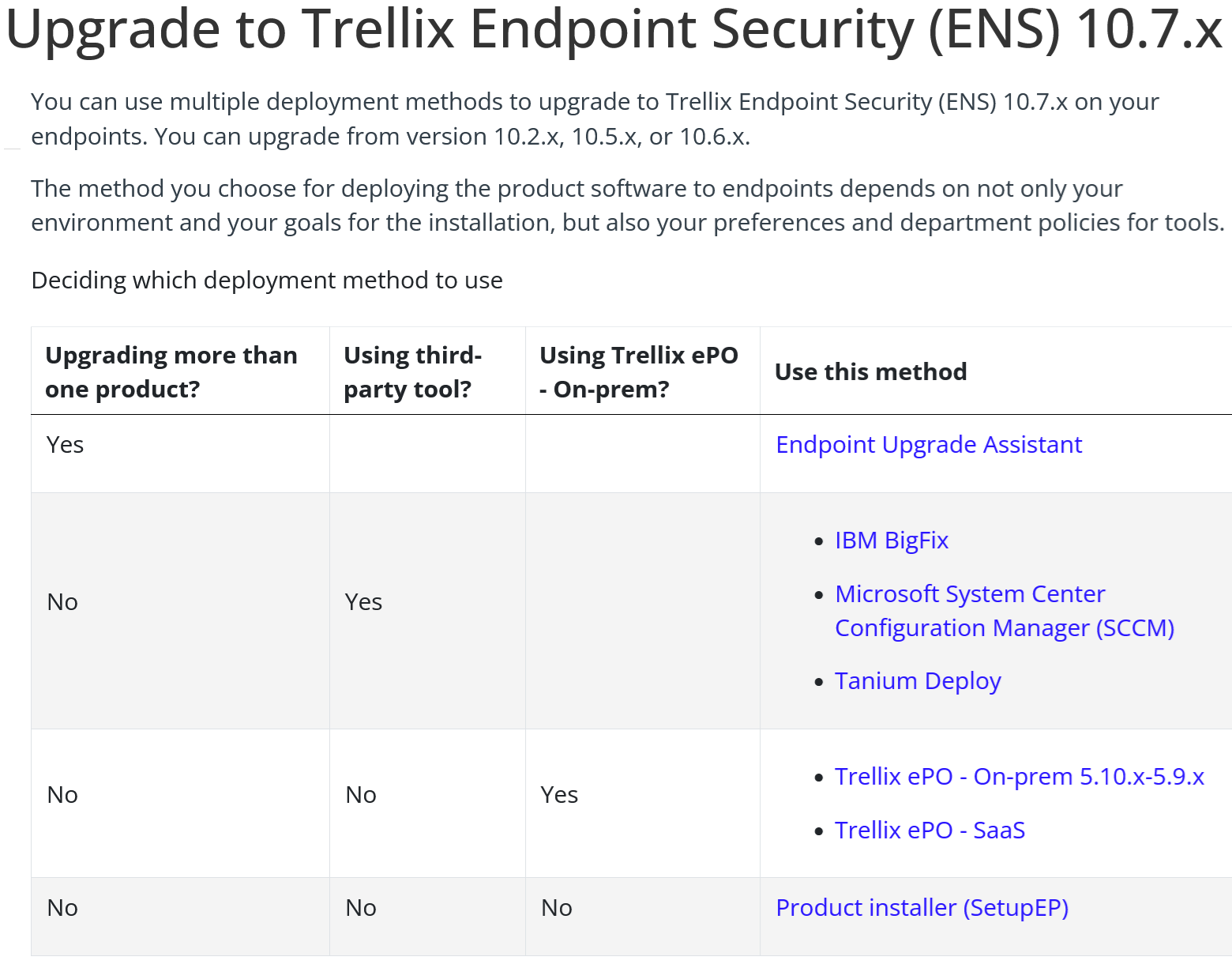
Developed decision-tree logic to route users to the correct path.
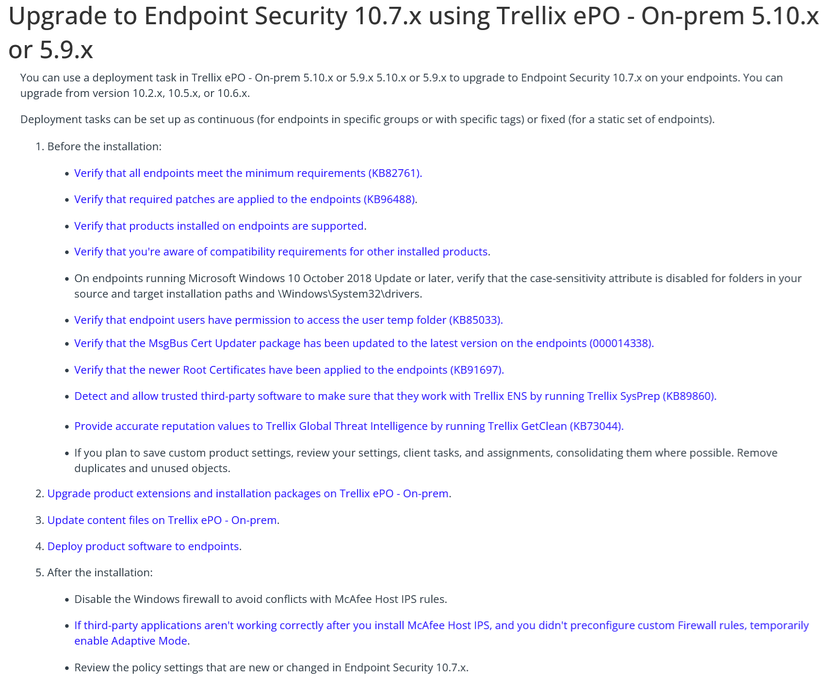
Designed dedicated, end-to-end workflows for each installation scenario, so users can install the software and go home.
Optimized each scenario landing page for search.
Identified where new content should live.
Documented how scenarios should be structured and maintained.
CONTENT IN ONE LOCATION WHERE CUSTOMERS EXPECT IT
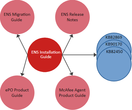
The scenario-based strategy succeeds
Why the scenario-based workflow makes it easy for customers to find, understand, and use the information:
Is the road map.
Provides hubs with all directions and road signs users need to get to their destination.
Gives the one best route to their destination.
Users only need to take one trip because all content is in a single place.
Reflects an outside-in perspective.
DECISION TREES GUIDES CUSTOMERS TO THEIR SCENARIO
END-TO-END INSTRUCTIONS FOR EACH SCENARIO
Usability testing
To validate the scenario-based approach, I led an A/B observational study with 11 participants, including 3 sales engineers and 3 professional service members who both worked directly with customers on installation:
Recruited study participants.
Determined what data to collect and which metrics to measure results.
Iterated through prototypes using the Balsamiq tool.
Developed study materials using templates developed by the UX team.
Coached junior writers on conducting studies and collecting relevant data.
Calculated quantitative data.
Drew qualitative conclusions based on participant feedback and writing best practices.
Reported findings and recommendations to executive sponsor.
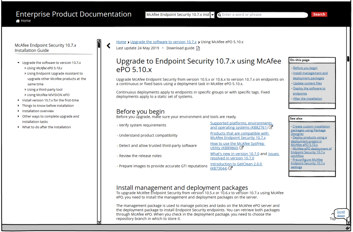
FIRST DRAFT
In the initial draft, the numerous inline links made scanning difficult.
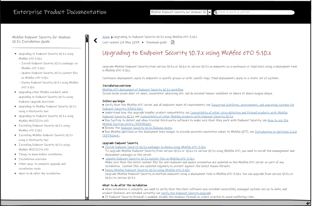
ON THIS PAGE ITERATION
Despite UX guidance that—in 2019—users didn’t “see” right-side navigation, several team members felt strongly about including it. I ran a few ad-hoc tests inside the team, but no one clicked on the “On this page” control.
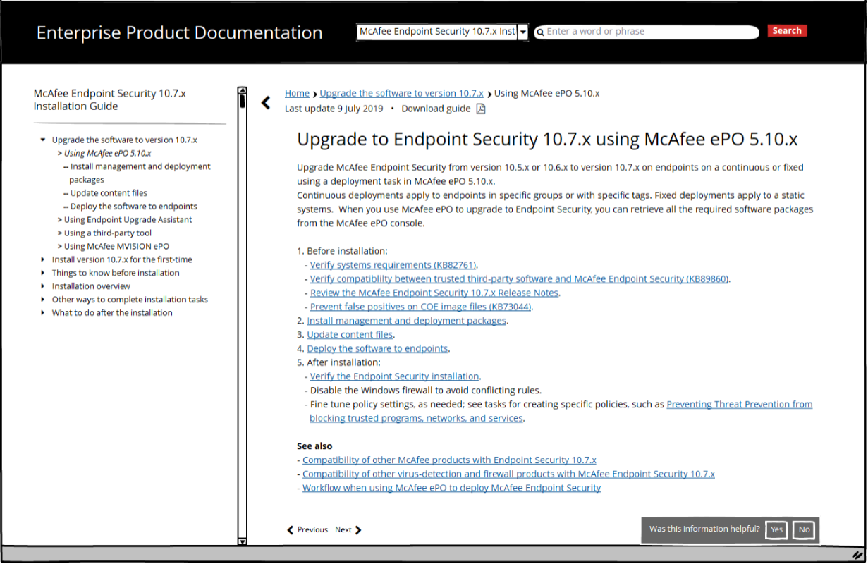
FINAL VERSION
By providing links with descriptive text, tasks in the scenario are easily scanned.
Results
The redesign produced measurable improvements across adoption, usability, search, and engagement:
Contributed to achieving the company's 99.95% installation success target.
Improved overall usability by 93%.
Increased customer satisfaction with installation tasks by 95%.
Increased keyword rankings by 43% within three months.
Increased installation content pageviews by 23% within three months.
Reduced reliance on legacy product version.
Lowered installation-related support demand.
The new design didn’t simply improve the content; it directly supported solving business problems:
Product adoption.
Customer retention.
Reduced support costs.
Migration away from legacy software.